
Lent 2014
I was recently tasked with designing some graphics for our Lent Series at church. Pastor Eric Simpson contacted me and we spoke through some design elements. He envisioned a weathered cross with the words 'Consumed!' branded on it. He wanted something to help focus our Lenten season around the role of the Holy Spirit in preparing for Passion Week.
So to begin I first did a mock up with Google image clips and photoshop, in an attempt to see what layout he might be thinking of before committing to buying any stock images. He liked what I did and gave me some edits. I then had the idea to photograph my own cross once I realized I could fashion one out of thick foam insulation. Something I did for a Nativity project last year.

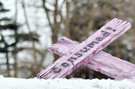
With that, I set out to make my own cross, burning the word 'Consumed!' on the front. I used my hot knife to carve lines into the insulation like wood. I then glued the two pieces together and made a stand. I went out into nature and photographed the cross in various poses. Some laying down, which Pastor Eric mentioned liking, some posed in other ways based on some images we liked. I then sent him those images and he picked a couple. He chose the ones showing trees in the background but no snow, so as not to emphasize winter as much.

I added a tint treatment, to remove the fact that the cross was pink and to get people to see only the old wood. Pastor Eric decided on the image he liked best and I added the words 'LENT 2014' to the bottom of the image. This image would then be used on everything related to this series; screen slides, the message note sheets, the bulletin cover, website header, group website thumbnail, and so on.
It's pretty interesting how much work goes into even the seemingly simplest graphic. It was a fairly quick project for the most part. It was a pleasure to work with Pastor Eric to get the image for this series figured out! Glad it came together like it did and happy with the final product.
-The Media Buff